Project: Better Marketing Branding and Website
-
Credits: Design & Creative Direction: Raewyn Brandon.
-
Description: Better Marketing is a new Facebook Ads Agency focusing on doing marketing, better. They keep things simple, so I wanted to keep the logo simple too!
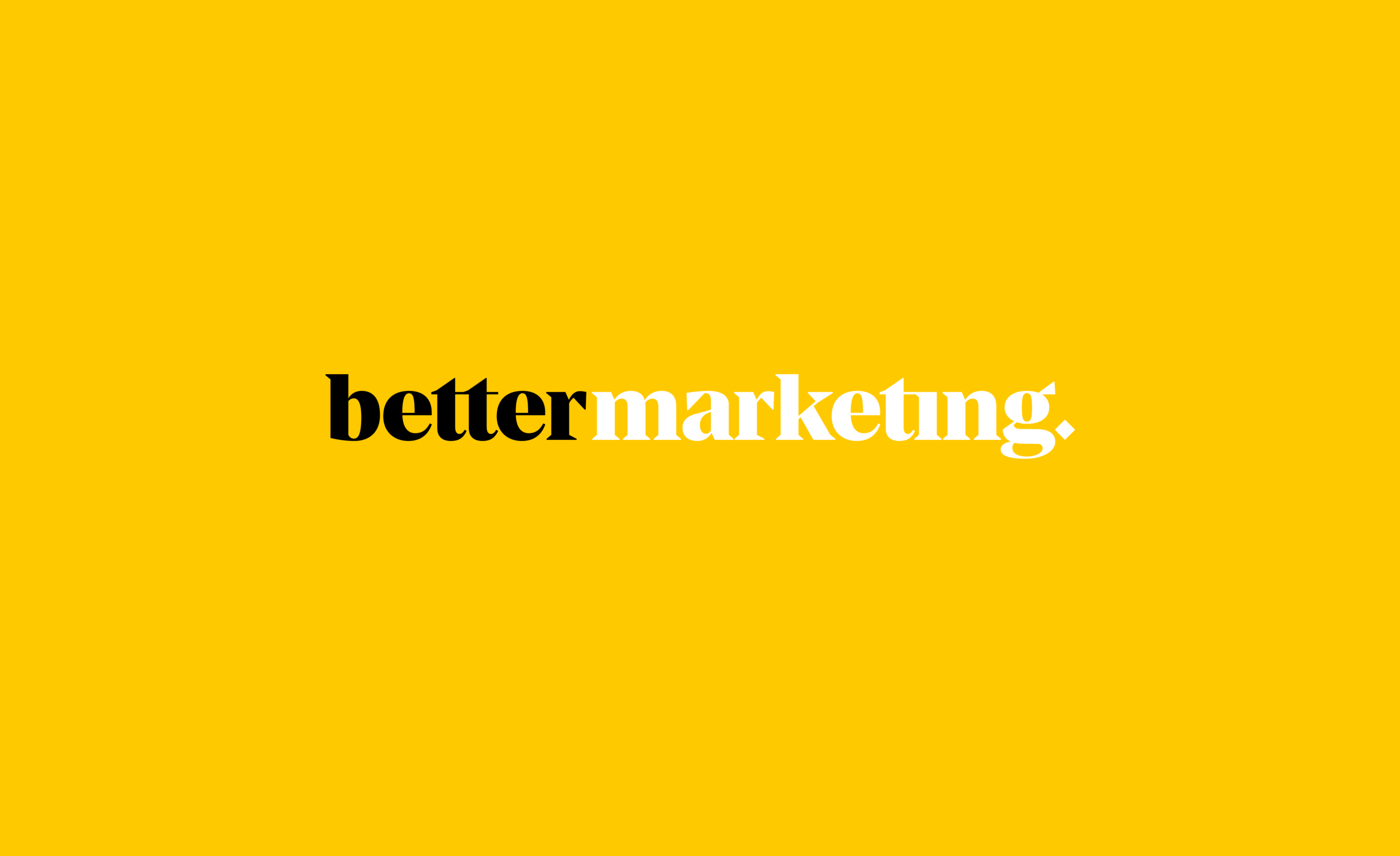
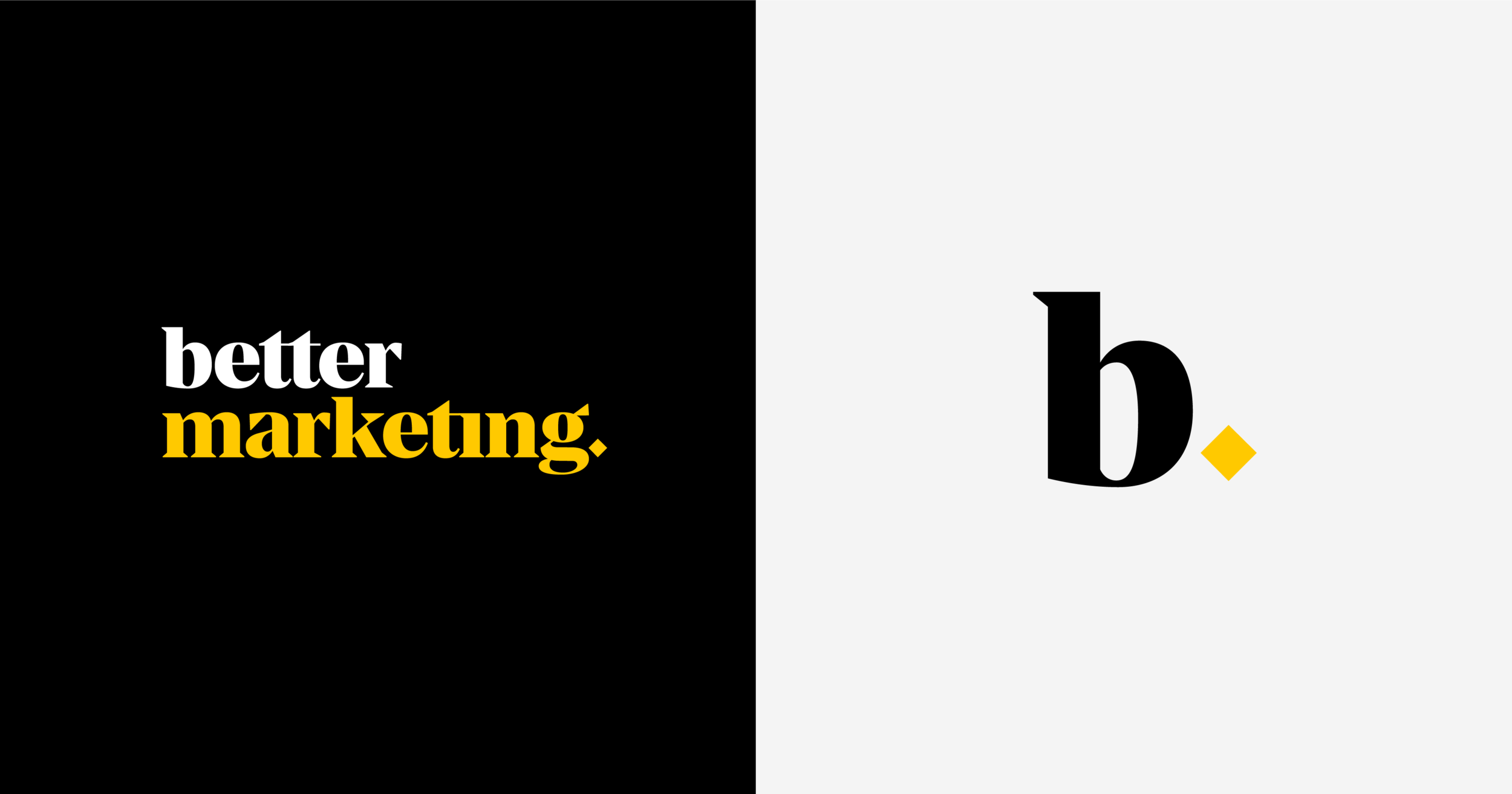
The typographic logo very simply presents the name, but with an emphasis on the word ‘better’. The brand uses the bold combination of yellow and black to attract new clients attention and stand out from the rest.
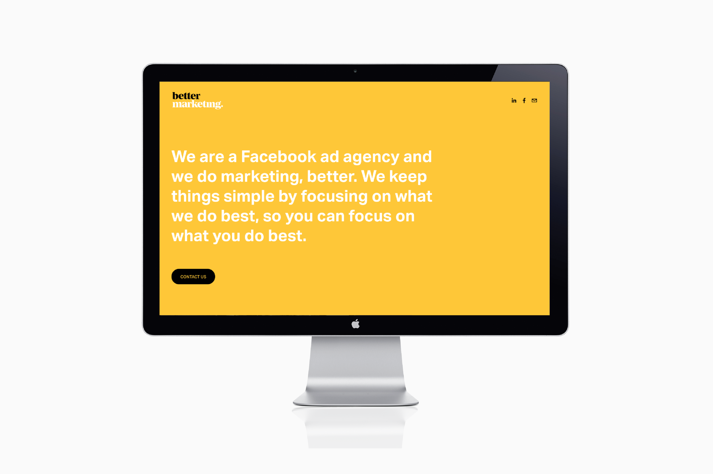
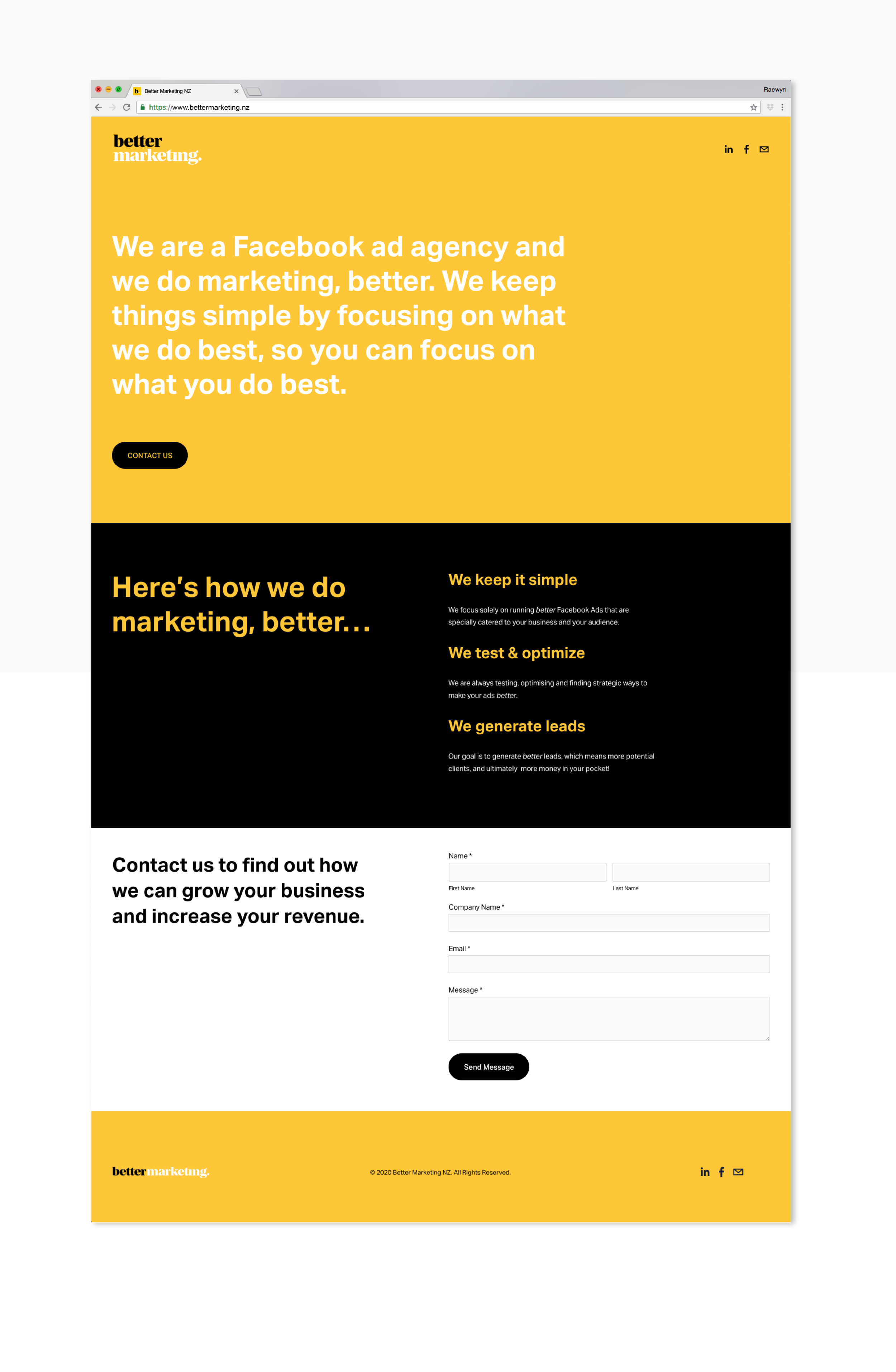
Again as Better Marketing’s motto is super simple, I went for a clean and minimal approach for the website, using bold typography and colours to communicate their message, plain and simple.