

Project: Episense Branding
-
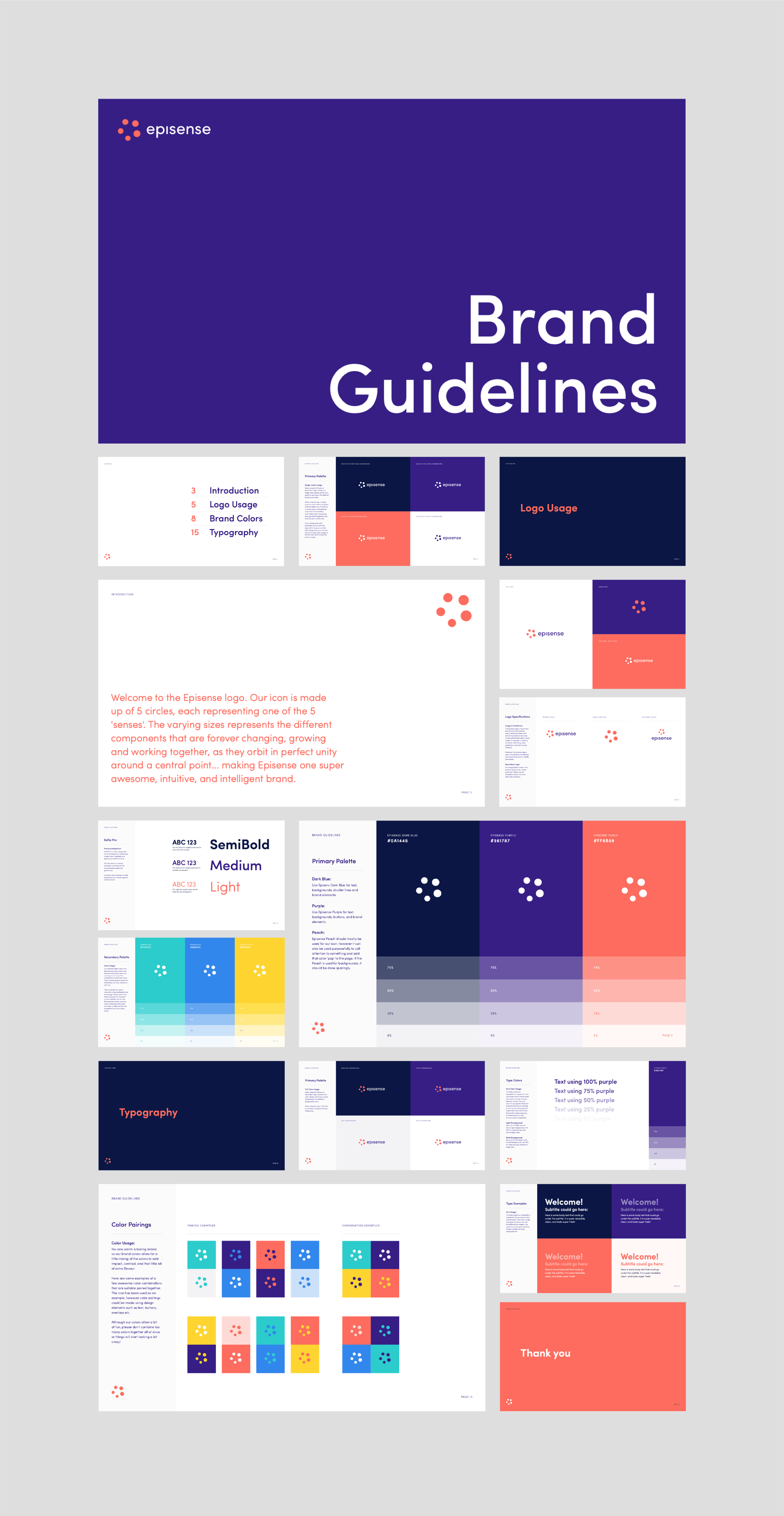
Credits: Design & Creative Direction: Raewyn Brandon.
-
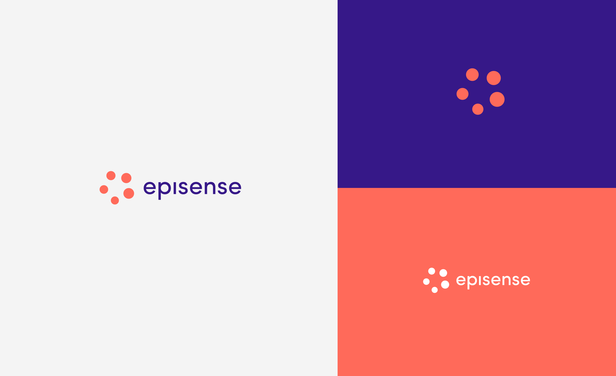
Description: Episense is a patented set of cloud infrastructure and developer tools that serves as a universal translator between all type of different devices within a building or home.
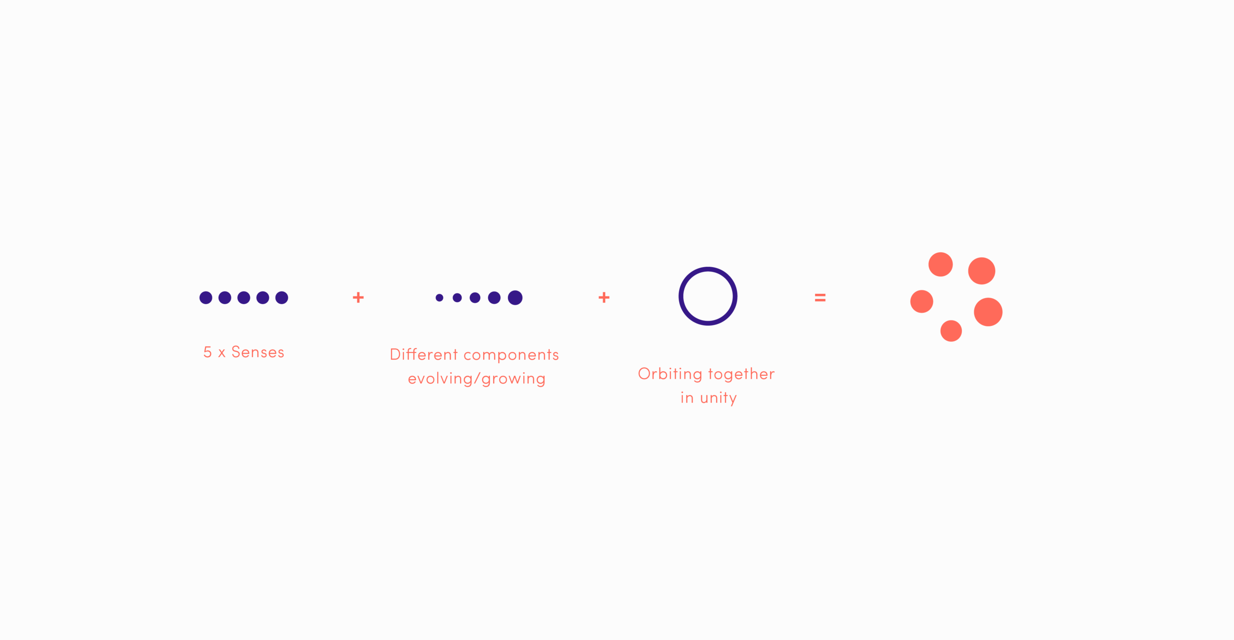
The logo icon is made up of 5 circles, each representing one of the 5 ‘senses’. The varying sizes represents the different components that are forever changing, growing and working together, as they orbit in perfect unity around a central point.. making Episense one super awesome, intuitive and intelligent brand.